▷ Data visualization: of Temperature, Humidity, and CPU Temp.
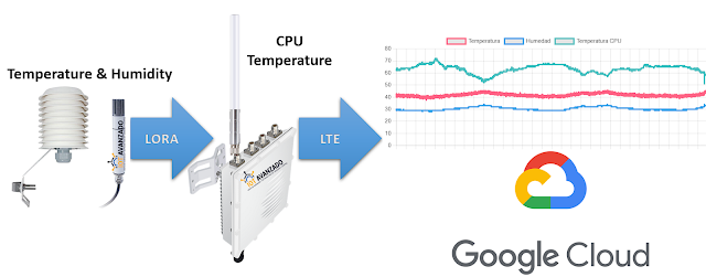
For this post, two sensors have been deployed for real-time data collection, currently operational in the city of Guayaquil: one for humidity and another for temperature. Both sensors utilize LoRA technology to transmit collected information to a Gateway. This Gateway serves as a central connection point, receiving data from the sensors and forwarding it to the Google Cloud platform via LTE cellular connectivity.
Leaflet viewer with OpenStreetMap
Once the data is stored on the Google Cloud platform, a customized web interface has been developed. This interface facilitates the visualization and analysis of the sensor-collected data, offering users a clear and easily accessible representation.
In this post, we'll explore how to visualize real-time data from Google Cloud using JavaScript and the powerful charting library, Chart.js. The goal is to create an interactive environment that visually and dynamically displays valuable information.
The code we're showcasing is an exciting introduction to real-time data visualization. The first thing you'll notice is that the web page has a striking title, 'Real-time Data Visualization,' which sets the main purpose of the page.
The body of the page contains a chart canvas <canvas> and a 'Download CSV' button. The magic begins in the JavaScript script embedded in the HTML code. This script has three key functions:
- loadSheetData(): This function loads data from a Google Cloud spreadsheet. It uses the Google Cloud API to retrieve information about temperature, humidity, and CPU temperature from the second row of the spreadsheet. These data are then used to create a dynamic chart using the Chart.js library. The line chart displays the evolution of these variables over time.
- convertToCSV(dataArray): This function converts the data obtained from Google Cloud into a CSV format (comma-separated values) commonly used for data exchange. This allows users to download the data in CSV format for external use.
- downloadCSV(): Here, the CSV conversion functionality is used to download a CSV file containing all the available data in the Google Cloud spreadsheet. Clicking the 'Download CSV' button automatically generates and downloads the file with the data for later use.
Here is the list of programming languages used for data visualization:
- HTML: Used to structure the web page.
- JavaScript: Used for dynamic operations, interacting with the Google Sheets API, manipulating dates, filtering data, and creating charts.
- Chart.js: JavaScript library used to render interactive charts on the HTML canvas.
In summary, HTML is used for structure, JavaScript for logic and data manipulation, and the Chart.js library for visualizing data in the form of charts.
This code is an exciting first step towards real-time data visualization from Google Cloud. It serves as an excellent starting point for those interested in understanding how to access and display data in an attractive and accessible graphical format.
Real-time data visualization
Read related topics
- ⭐ Dashboard
- ⭐ For Agriculture: Irrigation System
- ➡️ Display of last 24 hours of Temperature, Humidity and Temp. CPU
- ✅2023 Journal: Design and Implementation of an IoT Control and Monitoring System for the Optimization of Shrimp Pools using LoRa Technology
- ✅2023 Journal: Device Free Indoor Localization in the 28 GHz band based on machine learning
- ✅2023 Paper: Evaluation of ML-based Positioning Systems with RSSI Measured on the User's Device or APs
- ✅2023 Paper: Comparison of Traditional ML Algorithms for Energy Consumption Prediction Models
- ✅ 2022 Paper: Learning-based Energy Consumption Prediction
- ✅2022 Paper: #Trilateration-based Indoor Location using Supervised Learning Algorithms
- ✅ 2021 Paper: #RaspberryPi-based #IoT for #shrimp farms Real-time remote monitoring with automated system
- ✅ 2021 Paper: Monitoring a turkey hatchery based on a #cyber_physical_system
- NEWS
- TALKS
- ✅ Learning-based Energy Consumption Prediction
- ✅ Localización en ambiente de interiores basado en #ML con radio enlaces de 28 GHz
- EMBEDDED SYSTEM
- ✅2021 Paper: Performance Comparison of Database Server based on #SoC #FPGA and #ARM Processor
- ✅2021 Paper: #FPGA Based Meteorological Monitoring Station
- ✅2020 Paper: Monitoring of system memory usage embedded in #FPGA
- ➡️ #FPGA projects for Engineering Students
- Sensor networks for #Agriculture (Paper)
- #PID control for DC motor
- #PID control for angular position
- Writing letters through eye movement using Machine Learning #ML
- EyeTracker #Classification of subjects with Parkinson's using Machine Learning #ML
- #EEG + #FlexSensor Medical Equipments - #HTMC
- Digital synthesizer
- Microcontroller Architecture #PIC #16F877A
- Behavioral signal processing with Machine Learning #ML (Paper)
- Phrases recognition with Machine Learning #ML (InnovateFPGA)
- Alphabet letters recognition with #MachineLearning using #EMG signals (Paper)
- #EMG signal #Classification with #MachineLearning (Paper)
- #Epileptic seizure prediction with #MachineLearning #ML
- #EEG signal processing with #MachineLearning #ML (Paper)
- #EEG + #EMG signal processing with #MachineLearning #ML


Fascinating analysis of temperature trends! The way data visualization can bring to life such complex information is truly impressive. It really helps to understand the global impact of climate change. These kinds of visual tools are essential for raising awareness and driving action. Thanks for sharing such an insightful post!
ResponderBorrarCheck more at: Pyapal TSPlus
Really insightful! Thanks for breaking this down.
ResponderBorrarAdobe Photoshop Download
SuperAntiSpyWare Pro
PC Helpsoft Driver"
Data visualization of Temperature, Humidity, and CPU Temp is crucial for monitoring system performance. For automotive needs, I recently checked out battery jump service which ensures your car stays ready even in unexpected situations.
ResponderBorrar