▷ Display of last 24 hours of Temperature, Humidity and Temp. CPU
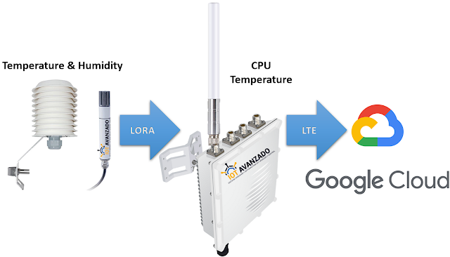
For this post, two sensors have been deployed for real-time data collection, currently operational in the city of Guayaquil: one for humidity and another for temperature. Both sensors utilize LoRA technology to transmit collected information to a Gateway. This Gateway serves as a central connection point, receiving data from the sensors and forwarding it to the Google Cloud platform via LTE cellular connectivity.
Leaflet viewer with OpenStreetMap
Once the data is stored on the Google Cloud platform, a customized web interface has been developed. This interface facilitates the visualization and analysis of the sensor-collected data, offering users a clear and easily accessible representation.
In today's interconnected world, the ability to gather and visualize real-time data is essential for understanding and making informed decisions. On this occasion, we will explore how to visualize the data from the last 24 hours of various variables captured by IoT devices using Google and Chart.js.
The provided code is a key component for this purpose. It integrates with the Google API to access and process data stored in a specific spreadsheet.
This code allows for the creation of dynamic charts for three distinct variables collected by IoT sensors: temperature, humidity, and CPU temperature. Through the Chart.js library, clear and concise visualizations are generated that display the evolution of these variables over time.
The magic happens when filtering the data to display only the information from the last 24 hours. This is achieved using JavaScript to select and present only the most relevant data, thus providing a specific and updated view of the behavior of the monitored variables.
Some important aspects of the code include:
- Use of the Google API to retrieve data.
- Filtering of data based on a specific time period (in this case, the last 24 hours).
- Creation of dynamic and clear charts with Chart.js.
- Visualization of temperature, humidity, and CPU temperature data in three separate charts for better understanding.
This integration between Google, JavaScript, and Chart.js provides a powerful and flexible way to efficiently monitor and visualize IoT data in a user-friendly manner.
Feel free to try this out and adapt it to your own IoT datasets! The customization and expansion capabilities are vast, allowing for the inclusion of more variables, design adjustments, and much more..
